Hi!
Here is another card I made using Basic Grey's Green at Heart paper. I really love this paper pad, but it has a lot of purple in it, and that is a color I find very hard to work with, as I am not drawn to it automatically. I thought I would challenge myself here to use purple, and I think I managed!
Technique Tip: I colored in the flower and the leaves using colored pencils. I used three colors for the flower and two for the leaves, blending using the lightest color until I got the look I wanted. It is easy to color small areas like these using colored pencils.
The flower is a stamp by Hero Arts, but I don't have a leaf stamp, so I hand drew those. The sentiment is also hand written. I layered everything with foam tape to add dimension.
Thanks for looking today! Please leave a comment!
Wednesday, December 29, 2010
Friday, December 17, 2010
Shabbat Shalom Card
Hi!
Technique Tip: I stamped, cut and colored the flower image twice, and layered them with some dimensional tape to get a cute 3D embellishment. I topped it off with Diamond Glaze and three half pearls.
Today I have another card to share.
The inspiration for this one came from my new Dymo (thanks Enid!) and October Afternoon Fly a Kite paper.
I sat down to create, and really felt like pulling out my colored pencils, which I have not done in a while. So out they came, and I chose two colors that coordinate with my paper, and used a simple blending technique on a Hero Arts flower stamp.
Technique Tip: I stamped, cut and colored the flower image twice, and layered them with some dimensional tape to get a cute 3D embellishment. I topped it off with Diamond Glaze and three half pearls.
Inside, I let each of my girls draw a little picture for their Granny, who is hosting us for lunch on Shabbat.
Thanks for visiting! Don't forget to leave a comment!
Tuesday, November 23, 2010
Welcome Baby Card
Hi!
Here is a little welcome baby card I made, using the Earth Love Mini Deck by Cosmo Cricket.
I paper pieced the little boat and water, and cut the cloud out of one of the patterned papers.
Jewels on the flower centers and some diamond glaze on the flags make the card shine, and the white stitching around the card brightened it up a bit and gave it a nice finished look.
This is a really simple design that you can recreate easily with any paper you have!
Thanks for having a look at my blog today!
Tuesday, November 16, 2010
Yummy!
Hi!
Here is a layout I made using another older picture of Eliyah that turned up when cleaning out the Mamad the other day. I love the way her eyes look so green in the photo, next to her green shirt.
I used October Afternoon Fly a Kite papers, on Kraft cardstock, and followed a sketch by Sketchy Thursdays.
Technique Tip:
I don't tend to spend a lot of money on ready made embellishments, that I may or may not find a layout for one day. So when I need something for a specific theme, I usually have to make it myself somehow. For this layout, I handmade the popsicle using two scraps of patterned paper, and then to add some shine, I covered the whole thing with Diamond Glaze. I stuck it on some foam tape to give it even more dimension, and I was done!
Thursday, November 4, 2010
Privacy
Hi!
As I was looking through my album, I saw this layout that I made recently using some papers from K and Co. and forgot to post here. Again, I kept this layout very simple, with just some layered patterned paper, some journaling strips I printed from Word, and a couple of Prima flowers. The colors in the photo were pretty blah, so out they went, and that was that!
As for the story behind the picture, it makes me laugh so hard! Eliyah likes to skype with Granny, Savta, and Tali, but she needs her privacy! So, sometimes, if there is too much going on in the living room, she unplugs the laptop and takes it to her room and gets all cozy in her bed to have her converstion. I can only imagine what she will be like as a teenager....
Thechnique Tip: I got this idea from Ingrid. To get that fun curly decorative edge strip I used under the photo, you cut a strip of paper, and snip along the edge half-way through. Then you curl up each segment. Easy!
Wednesday, November 3, 2010
Draw New Things
So here is a layout I made using Basic Grey Green at Heart papers.
I kept this one really simple, and spent most of my time making those flowers while listening to music....
I also used an old Cuttlebug alphabet for part of the title, which I haven't done in ages. It's time to put those things to use that have been neglected for too long! Use it or sell it is now my motto.
Onto the picture. I had to basically stand on my head to get a picture of Nili at the coloring table drawing, as the table sits against the wall in a corner, but that look on her face was too precious to miss. She was so proud as she showed me that she can now draw flowers. They are beautiful, long stemmed, whimsical, rainbow colored things that just make me smile. The amazing thing is that the day before this picture was taken, she couldn't do it. I mean she didn't know how to draw a flower. Then, the next day, she suddenly decided that yes, she can draw a flower... and she did it! It is absolutely amazing to watch her learn and develop like this, right before my very eyes!
Technique tip: To help fill in the background a bit, I used a couple of die cut scalloped circles as a stencil, and traced around them with my black pen. I hesitated before doing this, as one false move could ruin the whole layout, but I think I'm satisfied.
Tuesday, November 2, 2010
Dream
Sunday, October 24, 2010
My Cutie
Such an old yet beloved picture of Eliyah, taken at my parents' house when we went there to visit in 2004. This child had a constant smile on her face, and was so easy to photograph!
I used papers from the Green at Heart collection from Basic Grey, and a piece of Basic Grey Basics called Manifest as the background.
I made the flower embellishment using some very old magic mesh I had in my stash, a punched scalloped circle, a button, some twine, and hand cut leaves. The Thickers are new, that I got on my recent shopping trip. I decided to use them instead of hoard them as I usually do!
For this layout, I used a sketch from Sketchy Thursdays.
This layout is also my submission for a Baby Girl layout, to Practical Scrappers.
Friday, October 22, 2010
Back to the old Mists!
I had to pull out my Glimmer Mists after a long while of them sitting neglected in the drawer for this challenge by Studio Calico, where we had to use a mist on old book paper. I didn't have any real book pages to use, but I found some nice text paper in my stash, by Making Memories. I think the patterned paper is by Cosmo Cricket, but I'm not sure, correct me if I'm wrong, and I got it from the very generous Ingrid!
Those Martha Stewart butterflies still haven't gotten old for me! I also used my trusty Cuttlebug butterfly die as well.
Sassy LIl' Sketches layout
Forgot to mention that this layout was done using a fantastic sketch by Sassy Lil' Sketches. I really enjoyed using this sketch, and it went great with the October Afternoon papers I wanted to use from the Fly a Kite collection.
Ein Yael
We went to this place on Chol Hamoed Sukkot, called Ein Yael, where the kids enjoyed a multitude of activities including stomping on grapes, painting fresca and milking a goat! There was so much to do there! The girls had a really great time, it was worth every minute in the heat!
For this layout I used October Afternoon and Basic Gray papers, and again made a handmade flower embellishment with my scallop circle punches, a button and some fibers. Also getting into stitching a bit on my layouts... and trying to use the Thickers I have in my stash, so I can justify buying more!
So Proud of Myself
Here is a layout I made using a Pencil Lines sketch.
Did a lot of distressing, and made a handmade flower embellishment using two scallop circle punches and some buttons and twine.
Used my new October Afternoon Fly a Kite papers for this- couldn't resist! Also used my new Basic Gray paper for the backgroud.
Did a lot of distressing, and made a handmade flower embellishment using two scallop circle punches and some buttons and twine.
Used my new October Afternoon Fly a Kite papers for this- couldn't resist! Also used my new Basic Gray paper for the backgroud.
Monday, October 18, 2010
Huge Grin
I felt the need to go back and scrap Nili's baby pictures, and this huge grin was just irresistible to me!
I used Pencil Lines sketch 125 for my jumping off point here.
Bunny Purim
Eliyah dressed up as a bunny for her first four Purims....
I used Pencil Lines sketch 160 for this one.
Pool Time
Here is a layout I made using sketch 108 from Pencil Lines. I have had that chipboard circle hanging around for years, and finally used it here.
Friday, October 15, 2010
Two Cuties!
I love this old picture that I found of the two girls, all dressed up to go to a wedding...
I used a sketch from Sketchy Thursdays, turned on its side, and combined the three photos into one....
I also pulled out my favorite distress ink, Broken China, to color some white Thickers to match.
I used a sketch from Sketchy Thursdays, turned on its side, and combined the three photos into one....
I also pulled out my favorite distress ink, Broken China, to color some white Thickers to match.
Me and Nili
Wednesday, October 13, 2010
That look of concentration
Yet another new layout! I have certainly been busy....
This one is for the GDT challenge over at Sketchy Thursdays.
The challenge was to use the sketch, something orange, and a punch, so I had to look back and find some old pictures of my kids, with some orange in it, and I used my uppercrest Fiskars border punch on the piece of cork.
This one is for the GDT challenge over at Sketchy Thursdays.
The challenge was to use the sketch, something orange, and a punch, so I had to look back and find some old pictures of my kids, with some orange in it, and I used my uppercrest Fiskars border punch on the piece of cork.
Tuesday, October 12, 2010
Nili's Friend Tali
Here's a layout I made using a sketch from Sketchy Thursday.
I started off with the strip of punched purple cardstock at the bottom, left over from another layout, and it all came from there.
BIG Art Attack
Eliyah loves to watch Art Attack, where she learns all kinds of amazing art techniques and ideas. Here she decided to make a Big art attack, which is taking things from everyday life and making them into a huge piece of installation art!
This layout was based on sketch #125 from Creative-Scrappers.
Monday, October 11, 2010
Tali!
Here is another layout that I made, during my scrappy morning with Ingrid....
This one followed the sketch from Sassylilsketches 10/7 sketch.
Thanks for looking!
This one followed the sketch from Sassylilsketches 10/7 sketch.
Thanks for looking!
Sunday, October 10, 2010
Well Hello there! It's been another while since I have posted last, but don't worry, I have a bunch of layouts to share to make up for it!
All of these were made using pictures from out trip to Norway in August. For the layout above, I took my inspiration from the colors in the photo and went from there. Simple, and easy! Plus, everything is better with butterflies!
The next one is of a nice tradition that has developed, of making challot with granny on Friday mornings when we are visiting. The children look forward to it all week! I used a paper pack from K and Co that I thought was cute. Couldn't be simpler!
For this next one I must give credit to Stephanie Howell for the inspiration for the layout and colors.... Love her stuff. I also went a little butterfly crazy, as you can see....
This one needs a bit of something but i can't think what??? I guess not every layout can turn out exactly as expected!
I do like how this one came out though... I had been hanging on to that background paper from K and co for years, and here it just worked out perfectly so I had to use it. See more butterflies???
Here is another quick and simple one, The part that took the most time was curling those thingies on that strip in the corner... Thanks Ingrid! Here I also stamped the journaling stamp directly onto the paper, which was scary, but it worked out fine!
So I guess that's it for now! Thanks for checking in on me!
Sunday, July 18, 2010
New Layout
What? Another post, with a picture of a new layout on it? Just a day after the last one??? Yes, It is true, I have been busy.... This Layout shows Eliyah with her ganenet and sayaat (kindergarten teachers) at her graduation party. I like to keep the layout simple, with the focus on the pictures. Here's a tip- when you have pictures with colors that you find hard to work with, print them in black and white! Here the picture had a lot of purple in it, and I do not have any purple papers at the moment, so the B&W solved my problem! Plus, I like the look of primary colors for a kindergarten page....
Enjoy!
Enjoy!
Hello!
Hello there everybody!
Lately, I have been doing a scrapping "camp" together with Ingrid, for girls on their summer vacation. We are making all kinds of things, including a mini album, tags, mini milk cartons, and more. I think the girls are all having a great time, and it has been amazing to see the cute work they come up with. They are all so creative!
In addition, here are my two latest layouts, from Yom Haatzmaut this year/
Thanks for looking!
Friday, May 7, 2010
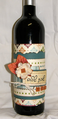
Shabbat Shalom!
Wednesday, April 28, 2010
Finally.....
some new layouts!
I haven't added my journaling yet....
This one was a scraplift from Stephanie Howell....
And this one still needs something. I love the photos, and I think I got the colors and the layout right. Maybe missing some embellishment? Anyone have any advice???
This one is Leon's favorite.... I just wanted to get the story down and followed a sketch from Pagemaps. The butterfly stickers were some cute glittery things from Hdar, that she got as a sample from CHA. Thanks!
This one is also a sketch from Pagemaps, but boy did I make some really stupid mistakes along the way.... you can barely see in the final result, but I think my brain was off half the time I was making this layout!
This one is actually the first time I used a sketch at all. I think I followed it too precisely, and it looks a bit plain as a result, but I think it came out ok... What do you think?
This picture was just too cute for works, so I did't really add any....
This was my first time using pictures of these sizes, and so many on one page!
Twice in the last two weeks, Ingrid, Hdar, and myself have gotten together for a crop. Both times I was super-productive and milked these girls for all they were worth- asking questions, advice, begging them for help and making them give me titles.... Maybe they were too busy helping me to get any work done themselves..... Sorry guys, but thanks for all the help!
Here are the pictures!
This one came together really quickly. The color had to be purple, and the only purple things I had were some old Basic Grey stickers, so I got some neutral cardstock and on they went!
This one I wanted to be bright and sunny, like Nili's personality....... She was so happy to have her birthday party in the park. We invited two of her friends from Gan and she was thrilled!I haven't added my journaling yet....
This one was a scraplift from Stephanie Howell....
And this one still needs something. I love the photos, and I think I got the colors and the layout right. Maybe missing some embellishment? Anyone have any advice???
This one is Leon's favorite.... I just wanted to get the story down and followed a sketch from Pagemaps. The butterfly stickers were some cute glittery things from Hdar, that she got as a sample from CHA. Thanks!
This one is also a sketch from Pagemaps, but boy did I make some really stupid mistakes along the way.... you can barely see in the final result, but I think my brain was off half the time I was making this layout!
This one is actually the first time I used a sketch at all. I think I followed it too precisely, and it looks a bit plain as a result, but I think it came out ok... What do you think?
This picture was just too cute for works, so I did't really add any....
This was my first time using pictures of these sizes, and so many on one page!
Ok so that's it. Thanks for looking, and please leave some feedback for all my hard work!
Good night!
Shalvi
Subscribe to:
Posts (Atom)